
Over the holiday weekend, I gave myself permission to stay away from my devices. And something surprising happened: every time I did glance at my phone, even just for a second, I noticed my anxiety tick up. Not a huge spike, more of a low hum of "I'm missing something." It took me a minute to realize what was going on. Then, I realized it wasn't the notifications. It was the colors.
I never thought about my home screen as a design choice that could affect how I feel, but once I started paying attention, I couldn't unsee it. So today I want to walk you through what I did to calm that reaction down, and I promise, the fix that worked best surprised me too.
Jump to:
- Key Takeaways
- My iPhone Color Experiment
- How to Try This on Your Own iPhone (Step-by-Step)
- Tips for a Less Distracting iPhone
- Create App Groups for a Simpler Design
- Placement of Apps: For a More Productive, Less Stressful Day
- Watch Your Color Choices
- Before You Redesign: 3 Questions Worth Sitting With
- Updated Tips and Hacks for 2026
- Conclusion
- Frequently asked questions
Key Takeaways
- Colors on your iPhone can trigger anxiety, so consider a calming wallpaper and uniform icon colors.
- Experiment with color settings like grayscale or matching icon colors to your wallpaper for a visually coherent design.
- Prioritize app placement: place essential apps in the top-left corner to reduce stress and enhance productivity.
- Decluttering your home screen and reducing notification badges also helps create a less distracting iPhone experience.
- Revisit your setup regularly to match your current habits and reduce visual noise.
My iPhone Color Experiment
Since I'm a visual person, I liked the idea of a uniform color scheme instead of dozens of different app-icon colors competing for my attention. Here's what I tried, in order, including what didn't work.
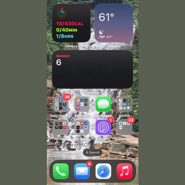
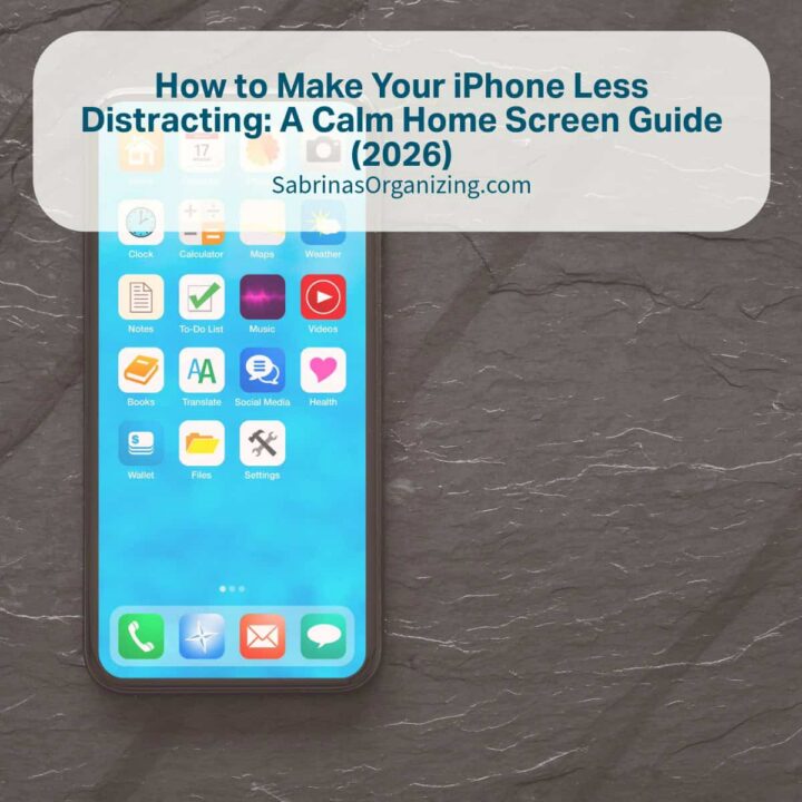
Here is the before home phone:
Option 1: Black-and-white (grayscale) mode.
iPhones have a built-in grayscale display filter, so I tried it first. The problem: it turned my waterfall-and-greenery wallpaper into a flat gray blob. It muted the distraction, but it also drained the calm I get from looking at that photo; not the win I was going for.
Option 2: Green icon backgrounds with white text.
Next, I tried green app buttons with white lettering. The green and white didn't have enough contrast, and my eyes strained trying to read the app names. Scrapped that one fast.
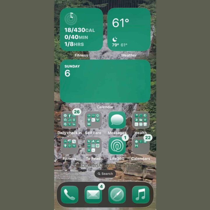
Option 3: Black text on a lighter green background.
This felt more balanced and easier on my eyes, closer to what I wanted.
The snafu: iOS automatically decides whether app group labels (affiliate) (the folder text) show up light or dark, based on how dark your wallpaper is behind them. Because my wallpaper is darker, iOS defaulted those group labels (affiliate) to white, which didn't match the black (affiliate) text I'd chosen for my individual icons. So I had to change it to keep the text white on the apps; otherwise, it wouldn't look "uniform."
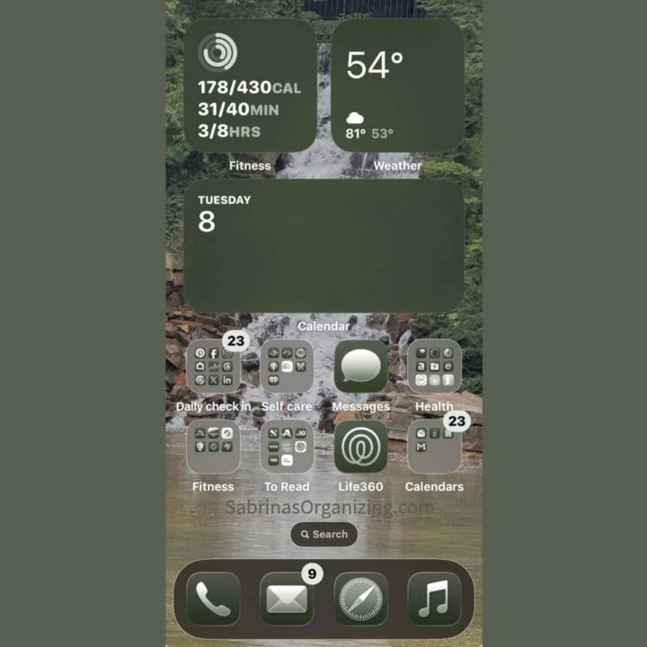
Option 4: Matching the exact tone of my wallpaper.
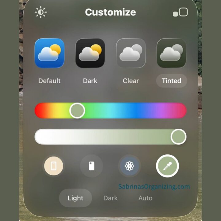
This is the one that finally worked. I used the color-picker (eyedropper) tool to pull a shade of green directly from my waterfall wallpaper, so my icon tint was the exact color already in my photo, not just "a green," but my green.
Once the background matched that closely, black (affiliate) text no longer had enough contrast to be legible, so I switched the icon text to light instead. That combination, a wallpaper-matched tint with light text, finally gave me a home screen that blended together instead of competing for my eyes. Less visual noise, less "phone anxiety," when I glanced at it.
How to Try This on Your Own iPhone (Step-by-Step)
You don't have to guess your way through this as I did. Here's the shortcut version:
Pick a calming wallpaper first.
Long-press your home screen → tap the + → choose or take a photo. Nature scenes work well: waterfalls, greenery, landscapes, the ocean-anything that isn't busy or high-contrast.
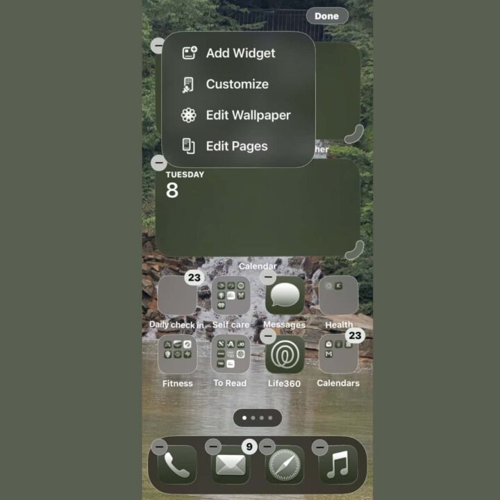
Customize your icon color to match it.
Long-press an empty area of your home screen → tap Edit → Customize. Choose Tinted, then use the color slider (or, on newer iOS versions, the option to automatically match your wallpaper) to land on a tone pulled from your photo. This applies the color uniformly across your icons and widgets.
Check your text contrast.
After tinting, look closely at your app names and folder labels (affiliate). If anything is hard to read, nudge the tint lighter or darker until the text pops just enough; you want it legible, not screaming for attention.
Try grayscale separately, if you want an "off switch."
Go to Settings → Accessibility → Display & Text Size → Color Filters and turn on Grayscale. This is a good option for a temporary, distraction-free mode (say, the last hour before bed) rather than an everyday look, since it also flattens your wallpaper.
This color filter section helps differentiate colors for users who are color blind and supports users who have difficulty reading text on the display.
Set up a one-tap grayscale shortcut.
Go to Settings → Accessibility → Accessibility Shortcut, select Color Filters, and now you can triple-click your side button anytime you want to instantly mute your whole screen; no digging through settings required. It is a clever feature; you can pick a variety of shortcuts to use the side button. Check the app for the full list of options.
Tips for a Less Distracting iPhone
Below are some simple tips to make your phone less distracting.
- Pick a wallpaper that genuinely calms you, and lean toward nature scenes - waterfalls, greenery, landscapes. Anything pulled from nature tends to read as calming rather than stimulating.
- Unify your app and folder colors to a tone that complements your wallpaper. When icons stop competing for attention, your eye has less to process every time you unlock your phone.
- Double-check your text contrast. Test both dark and light text against your chosen background, and pick whichever reduces eye strain most. The goal is "readable," not "eye-catching."
Create App Groups for a Simpler Design
If your home screen feels like too much, take an honest inventory of what's actually on it. Do you still use every app? If you find several apps that share a theme, group them into a folder with a clear, specific name. Think Takeout, Dining, Self-Care, Health, Finance, Call/Text, Travel, Home, or To Read.
One rule of thumb: avoid vague folder names like "Productivity." A label (affiliate) that broad doesn't help your brain find anything quickly; it just becomes another digital junk drawer.
Placement of Apps: For a More Productive, Less Stressful Day
Here's the part of this project that genuinely surprised me: where you physically place your apps affects how stressed or frustrated you feel using your phone.
In the Western world, we read left to right, so our eyes and our habits gravitate most toward the top-left of a screen. That makes top-left your most valuable real estate. Put the apps that support the habits you actually want there. If you're trying to move more, that could be a fitness app. If you want to build in more mindfulness, that could be a meditation app.
The center of your screen is a good home for things you reference often but don't necessarily tap into every time; a calendar widget is a great example.
The bottom of your home screen works well for apps you want to check later in the day; again, prioritizing left to right in terms of importance.
If you have more than one home screen page, you can repeat this same left-to-right, top-to-bottom priority pattern on each one.
Resources on the psychology of app placement:
- Attention Allocation on Mobile App Interfaces When Humans Interact With Them - PMC
- How User Psychology Shapes the Apps and Websites You Use Every Day - Champlain College
Watch Your Color Choices
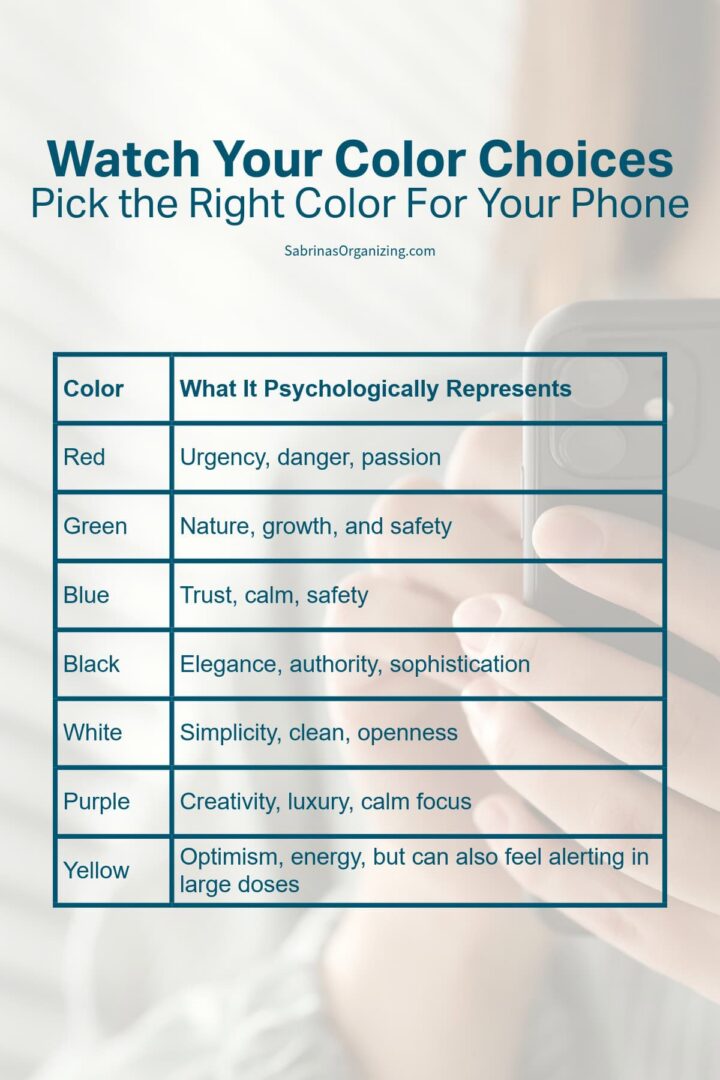
Colors carry more psychological weight than most of us realize, which is exactly why so many apps default to red. Red signals urgency, danger, and passion, and every time a red badge or icon catches your eye, it's quietly nudging your nervous system. Avoiding red on your home screen can help you avoid feeding that reflexive anxiety.
| Color | What It Psychologically Represents |
| Red | Urgency, danger, passion |
| Green | Nature, growth, and safety |
| Blue | Trust, calm |
| Black (affiliate) | Elegance, authority, sophistication |
| White | Simplicity, clean, openness |
| Purple | Creativity, luxury, calm focus |
| Yellow | Optimism, energy, but can also feel alerting in large (affiliate) doses |
Before You Redesign: 3 Questions Worth Sitting With
Before you start moving icons around, pause and consider why your phone feels stressful in the first place. A few questions to ask yourself:
- Which specific apps make my stomach tighten when I see their icon? That reaction is information; it might be worth taking a bigger break from that app, not just changing the color.
- Am I glancing at my phone out of habit, or because I actually need something? A calmer home screen helps either way, but it won't fix a habit loop on its own.
- What do I want my phone to help me do more of, and is that app in my top-left spot? If not, that's your first move.
Updated Tips and Hacks for 2026
A few extra ways to build on this that go beyond icon color alone:
Turn on a Focus mode for deep work or wind-down time.
Focus modes let you silence notifications from everything except the people and apps you choose, so your phone isn't pulling your attention with badges and banners while you're trying to concentrate or relax.
Try StandBy mode at night.
If you charge your phone on your nightstand (affiliate), StandBy turns your screen into a calm clock/widget display instead of a full home screen, so late-night glances don't turn into scrolling.
Use Screen Time to set app limits, not just track usage.
Setting a daily limit on your highest-anxiety apps (Settings → Screen Time → App Limits) adds a small, helpful pause before you open them out of habit. Here are instructions for Screen Time.
Turn off badge icons (the red notification dots) for non-essential apps.
Settings → Notifications → [App] → toggle off Badges. This alone removes a lot of the "urgent red" visual noise from your home screen. Here is a community discussion for turning off badge icons.
Keep it to one home screen page if you can.
Move everything else into the App Library (swipe left past your last page) and search for apps you use less often instead of scrolling past them daily. This is a great option, but if you are a type A person, this may be too much, but you can give it a try. I always felt I needed these apps organized not only for my personal life but also for my business.
Revisit your setup seasonally.
The apps and habits you want front and center in January aren't always the ones you want in September. A quick seasonal check-in keeps your home screen aligned with your current priorities. Try checking it every quarter: January, April, September, etc...
Conclusion
I hope this post helps you figure out a layout that feels calm instead of chaotic every time you pick up your phone. It's a small project, but the payoff, glancing at your phone and feeling nothing instead of that little anxious tug, is worth the twenty minutes it takes.
Now I want to hear from you: how do you design your phone? Drop a comment below and let me know what's worked (or hasn't) for you.
Frequently asked questions
Colors carry psychological associations; for example, red signals urgency and danger, which can trigger a subtle stress response every time you see it, even in something as small as an app icon or notification badge.
A cluttered, high-contrast home screen adds visual noise on top of that, which can compound the feeling.
Red is widely associated with urgency and alertness, which is why so many apps default to it for notification badges. It's designed to grab your attention.
Reducing how much red you see on your home screen (through icon tinting or turning off badges) can help lower that reflexive, urgent feeling.
Long-press an empty area of your home screen, tap Edit, then Customize. Choose the Tinted option and use the color slider or the automatic wallpaper-match option (depending on your iOS version) to pull a color that complements your background image.
Grayscale (Settings → Accessibility → Display & Text Size → Color Filters) removes all color from your entire screen, including your wallpaper; good for a temporary, distraction-free mode.
Tinted icons keep your wallpaper in color but apply one uniform tint to your app icons and folders, which is better for an everyday, less-jarring look.
Put them in the top-left corner. Most of us read left to right, so our eyes and habits gravitate there first; it's the highest-value real estate on your screen for the habits you actually want to build.
It helps, especially when paired with a calming wallpaper, a unified icon color, and turning off unnecessary notification badges.
Decluttering reduces the visual noise your brain has to process every time you unlock your phone, though it works best alongside examining why certain apps feel stressful in the first place.
Want more ways to bring calm into your daily routines? Check out my other posts on decluttering your space and your schedule.



Looking for some accountability in your life? I can help! Check out my Virtual Organizing Services to see the areas where I can help you stay on track and get things done.



Diane Quintana says
I keep my phone on silent most of the time and have set times to check mail and messages. I admit that I check it more frequently when I'm bored. I do a little scrolling through Instagram...
I agree that combining apps into often used groupings or categories is helpful. I need to go in and delete some of the apps I have downloaded.
I like your step-by-step instructions!
Sabrina Quairoli says
Thanks for commenting and joining in the conversation, Diane. It really depends on each person and what affects them. I am a big fan of observing behaviors to determine what distracts us and keeps us from focusing.
Seana Turner says
For me, this is a balance of wanting my phone to be easy to use and not distracting.
I have turned off alerts for most apps now. I decided I just didn't like seeing that little red circle be cause it made me feel urgency to check, which I didn't want. Plus, once I started wearing a connected watch, I wanted to minimize the times my watch buzzes me.
I tried the grayscale thing but I strongly disliked it. I found it harder to find the apps I wanted and it honestly felt a little depressing. Haven't tried monochromatic, but I think I'll feel that it makes the apps harder to find for me. Maybe this is me getting older and my eyes growing worse.
I never thought about the left-to-right thing, but this makes perfect sense. I'm going to think about this and maybe move things around a bit. Of course, this then takes some getting used to, but it will probably be worth it. Great suggestion!
Sabrina Quairoli says
Thanks for joining in the conversation, Seana. I really appreciate it. =)